What is it?
Detailed specifications on the component and how to build it.
Why do we do it?
So that Developers know precisely how to build the component and all the states required for it. It also helps us best understand how to make this component in Figma.
How do we do it?
Depending on if you’re creating a new component vs. updating an existing one, there are two methods for your spec doc.
Create a new spec doc if your component update differs substantially from the original.
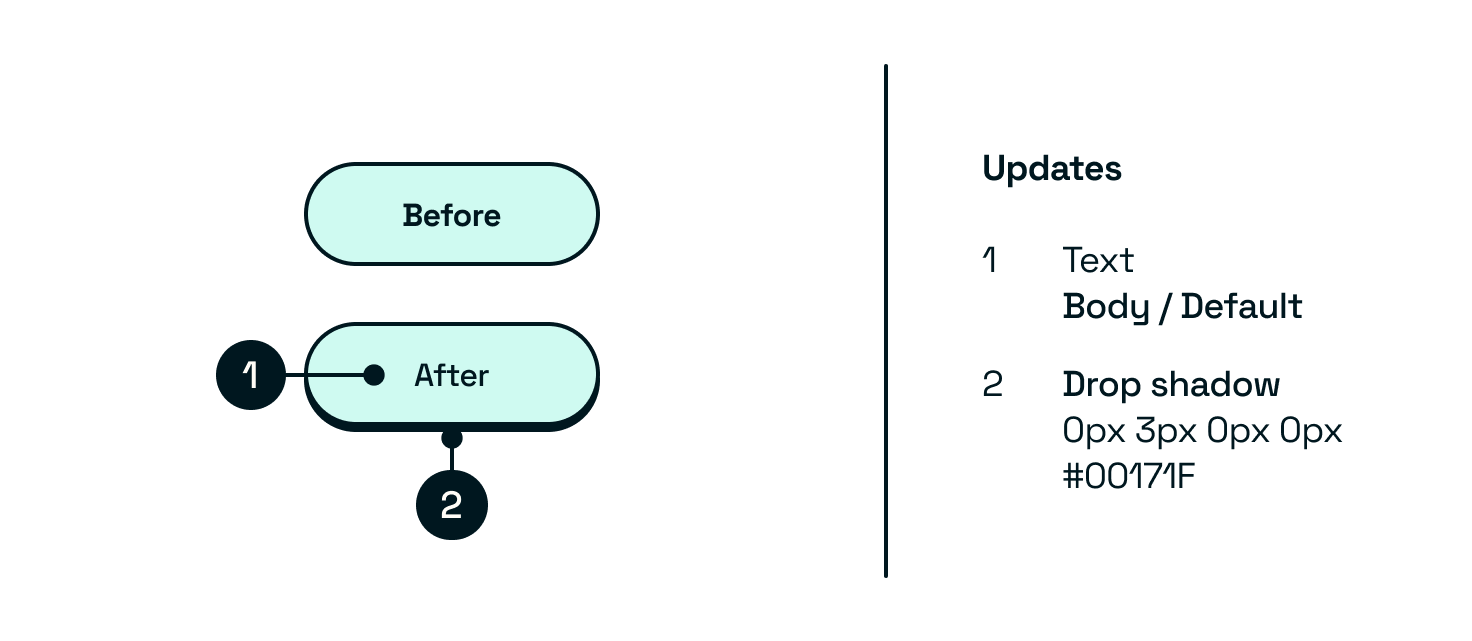
Updating existing
Updating existing components can be much simpler to document. Just include a before and after, highlight the changes and give the updated values.
New components
For new components, use a complete spec doc outlining all of the specifications from the ground up.
Take each variation in the following list and run the Eightshapes Specs plugin in Figma to break down your designs into full specs. You’ll want to review the results to make sure they line up.
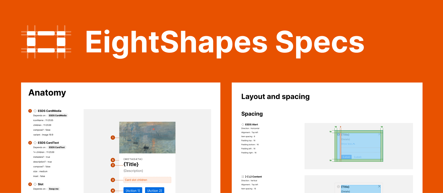
You can do all of this manually, but a plugin will save you a lot of time — and this one is great.
If you want more information on these variants, head back to the exploration phase.
Type(s)
Include all of the different types available for this component.
Priority
| Primary |
| Secondary |
| Tertiary |
| Accent |
State
| Default |
| Disabled |
| Hover |
| Active |
| Focus |
Platform or screen size
| Desktop / large |
| Tablet / medium |
| Mobile / small |
Status
| Positive |
| Negative |
| Warning |
| Default/neutral |
Sizes
| Small |
| Medium |
| Large |
| or pixel value |
Booleans
Any elements that are shown/hidden or on/off
| Selected — Yes/No |
| Optional Messages — show/hide |
Dynamic text
| Any text that is override-able |
| What text supports markup/markdown |
Tokens
| Colours |
| Text styles |
| Spacing |
| Scale — any applicable min/max sizes |
Interaction and animation
You’ll need to add the details for these manually.
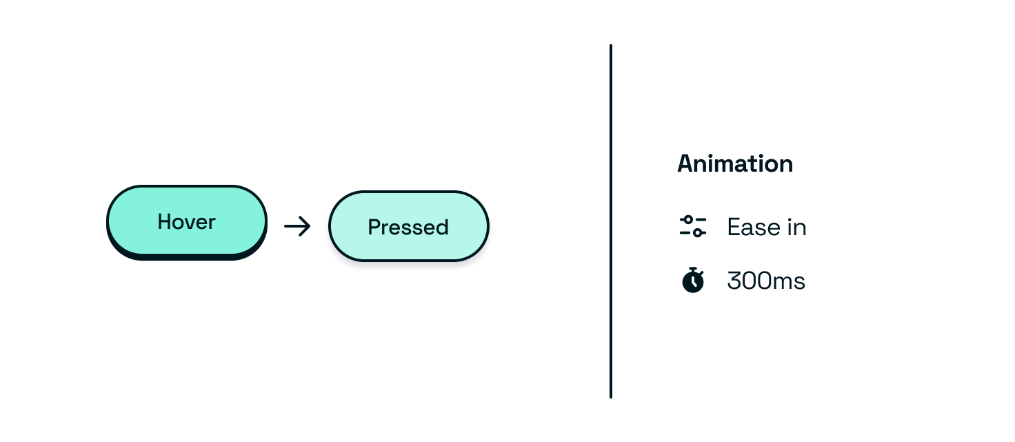
| Working prototypes |
| Any tokens or values applicable to this, including animation duration and style |
Accessibility
| Visual text scaling and how the component changes with larger and smaller fonts |
| Voiceover guidance |
Colour mode examples
Provide everything you’ve done above in different colour modes; this should be reasonably straightforward if you have variables set up for colour modes.
| Light |
| Dark |
| Any other colour modes you might need |
Handy links
Outcomes
- Alignment of final designs
- Figma file with component specs