What is it?
A detailed review of your existing product experience — specifically around the use of the component you’re auditing.
All audits will look slightly different based on what you’re auditing. Generally, it’ll comprise of a series of screens, split by platform and screen size — coupled with notes and observations.

Why do we do it?
It’s impossible to know your current component’s issues or how the experience is performing without a detailed overview of the product. Doing an audit allows us to see misalignment, inconsistency, UX issues and gaps in our experiences.
But the biggest reason we do it is to answer this question: do you even need it?
Is there another component that performs a similar function, or would an update to an existing component support this? Is there a different pattern that would work better for your use cases? And finally, is this component simply plugging lazy or poor UX?
How do we do it?
Review the existing experience
Go through product screens and gather as many examples as possible of where this component is currently being used, including where it could/should be used — this will also highlight where components are being misused or misaligned.
If you’re auditing for a new component, review all of the interaction states in your experience as well.
Work with your Developers
Your Developers can easily find out where a component is being used in the product. This will make it easier to find them within experiences without mindlessly searching — they’ll also have a better idea of where other components are being misused.
They can also help identify where native components have been used vs. your system components or … dare I say it, where custom components have been implemented — custom components can be deceiving as they may look and act precisely like system components but don’t get the fundamental support or updates from your System, so it’s essential to weed them out and find out why they’re custom.
Chat with product teams
If you can, be sure to engage your product teams to crowd-source as many examples of what you’re auditing as possible; you’ll likely also get a lot of initial feedback from these people.
Things to look out for
Design
- What are the visual differences between each example?
Use case
- Are they being used for the proper purposes?
- How do they differ, and why?
Interaction and animation
- Look at the hover, active and focus states.
- Are they all different?
- Do they animate in the same way?
Accessibility
- How do they scale
- Do they support voiceover?
- Is it understandable?
Tone of voice
- Have they been written in the same/similar format?
- Has the wrong tone of voice been used in a particular use case?
Cross platform differences
- Do your iOS, Android or web platforms look different?
- Has this change been made intentionally?
Take notes as you go
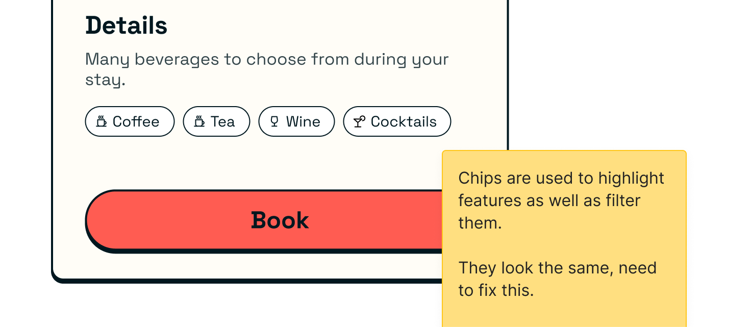
Be sure to add post-its or comments as you go to highlight important pieces, inconsistencies or ideas — and don’t be afraid to allow the project to evolve as needed.

You can also run a meeting post-audit and share it back to get additional feedback — this will highlight things you may have missed.
Requirements gathering
This process will leave you with a comprehensive collection of the different experiences that are or should be using your component. At this point, you should start listing the requirements needed to align your component in each use case for scalability.
By aligning and defining these requirements, you’ll have the opportunity to find more innovative and scaleable ways to solve design problems across many areas, which you can further explore in the design exploration phase.
Outcomes
While every audit is different, usually you should end up with the following —
- A comprehensive overview of component usage across platforms
- A collection of examples structured by area and platform
- A list of considerations, ideas, outcomes and next steps

