What is it?
Documentation and usage guidance of the component in design and build. It’s a living document that continuously evolves as your System does.
Why do we do it?
Documentation exists to support others when using your Design System. It allows you to define best practices and reduces the load on day-to-day support by enabling users to self-serve.
Clear and articulate guidance paired with solid reasoning and rationale makes your documentation an undeniable source of truth and gives your work added visibility.
How do we do it?
This section will cover what to include in your component documentation, not how to set up your documentation site.
Pair with your Developers
Depending on your team setup, if you can, you should be pairing with the Developers on your team to do this work. Implementation and usage in build are just as important as design.
What to include
Try to include relevant visuals in each section to make the content more digestible to users.
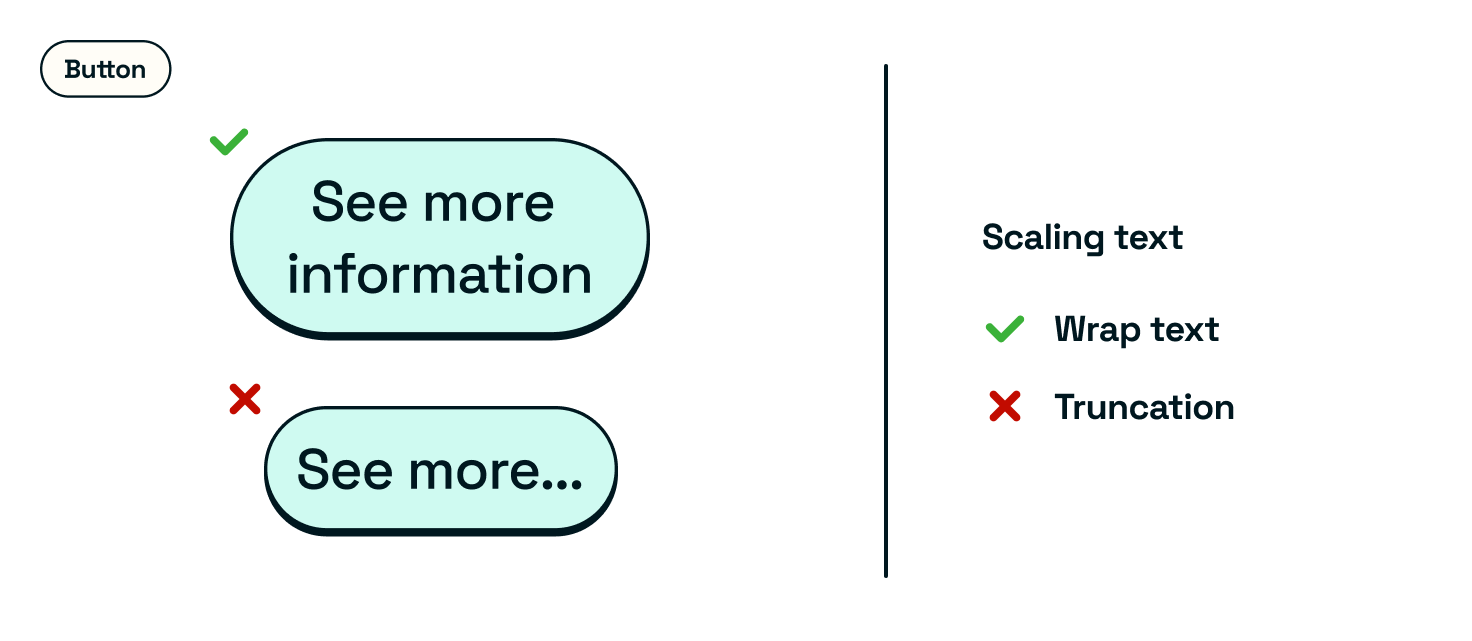
Be sure to include examples of do’s and don’ts within relevant sections.
An introduction
Purpose statement
This is one to two sentences explaining the overall purpose of your component.
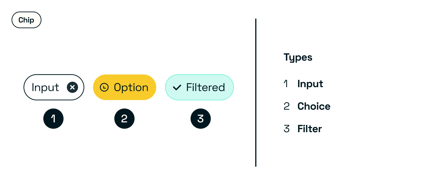
Component image
A visual of your component type(s).
Bonus points if you use a live component and not static images. This way, you’ll be able to showcase it in all its glory. Not to mention, building a documentation site that uses your system is the ultimate dogfooding exercise.
Type(s)
If you have multiple component types, depending on how much they differ in guidance, you may want to break the following up into sections for each.
Otherwise, you can showcase all of them under a type section covering each available type and use case.
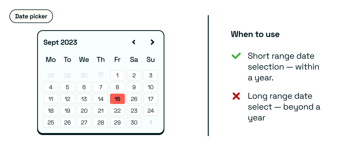
When to use
Use cases and examples on when to use, as well as when not to use this component.
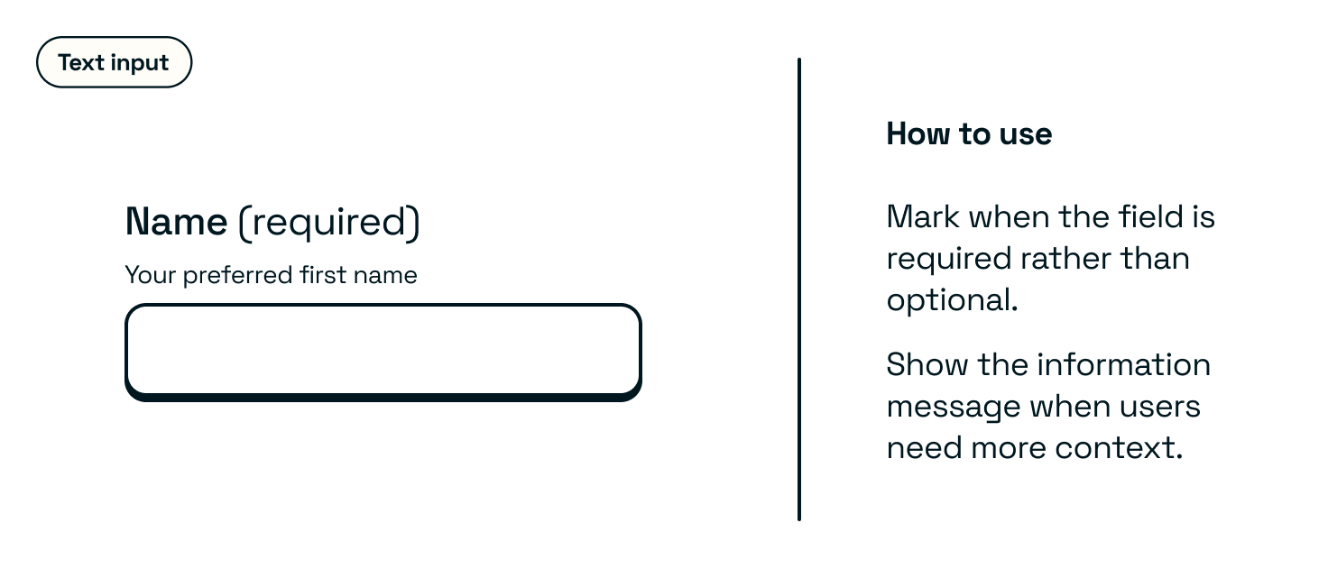
How to use
Best practice guidance and examples on how to use, as well as how to not use the component.
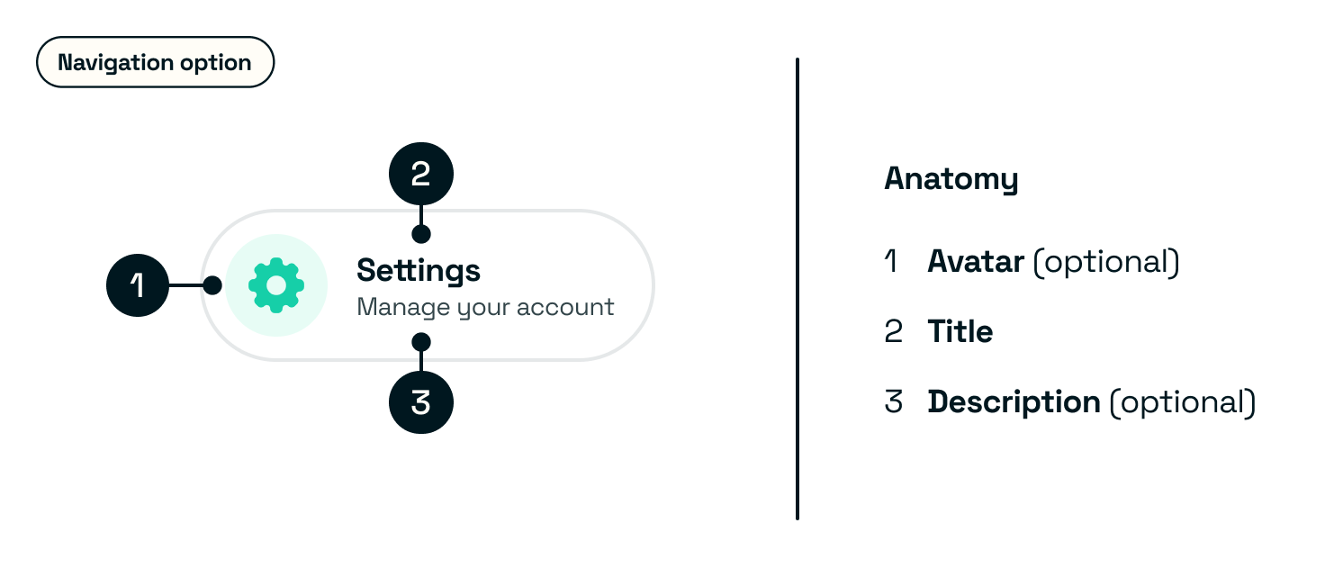
Anatomy
A visual breakdown of your component with all of the different available props. Be sure to highlight where things are optional.
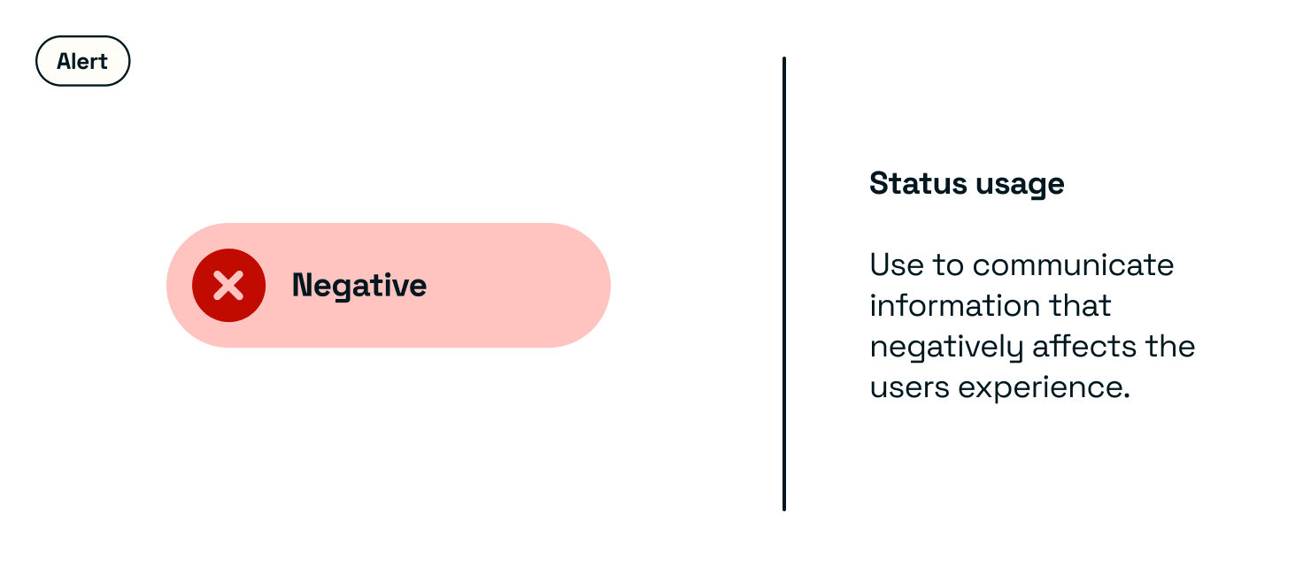
Status
The different statuses available to the component and when you would use them.
Accessibility
Any accessibility considerations on the component itself, including when the component scales or when screen readers are used.
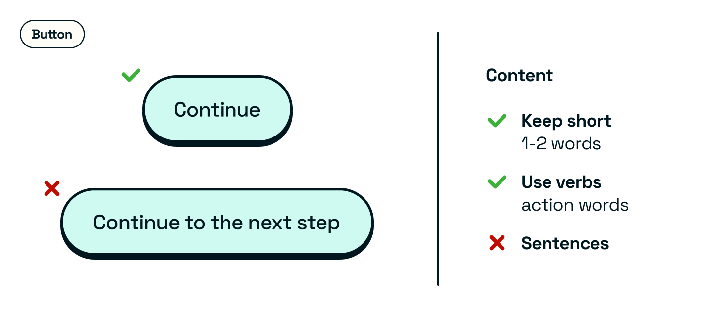
Content guidelines
Rules on micro-copy on your component. This can include length, tone of voice, and any do’s or don’ts for writing copy on this component. Some components won’t need this, but for copy-heavy components, it is helpful to include a guide.
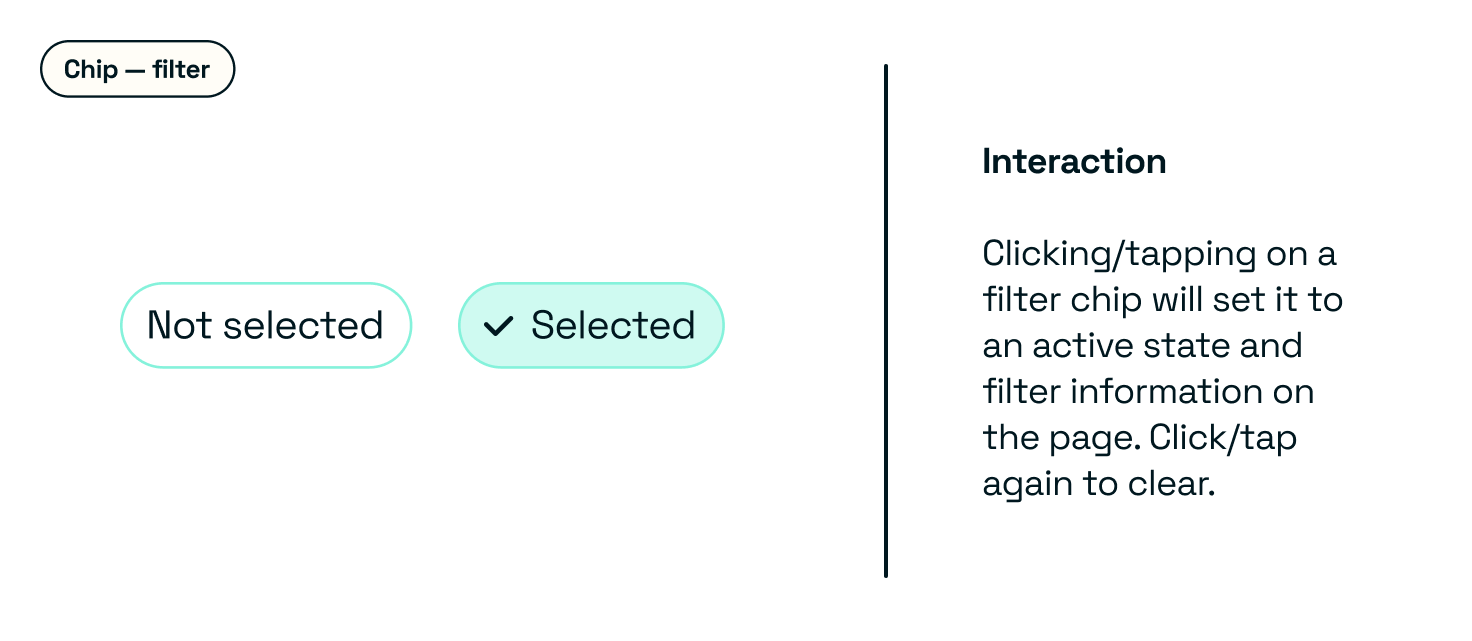
Interaction and animation
How the user can interact with the component and what happens. It’s handy to use live components here to demonstrate interaction adequately.
 Any rules on animation, if applicable, and a visual example of how the component animates.
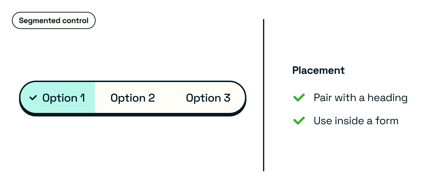
Placement
Where to place the component on the screen or what to pair the component with.
This can include other rules, including minimum or maximum height or width.
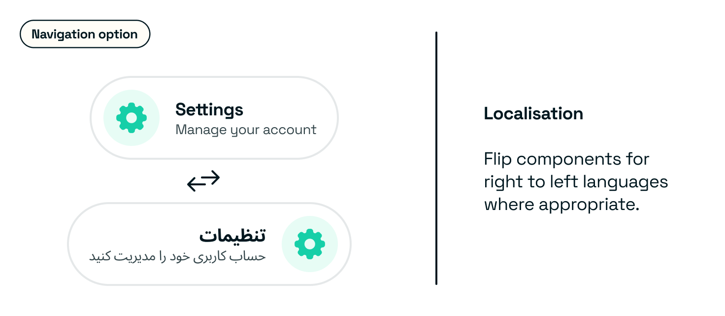
Localisation
Any specific information or support for different regions. Include copy guidance or even design changes based on region.
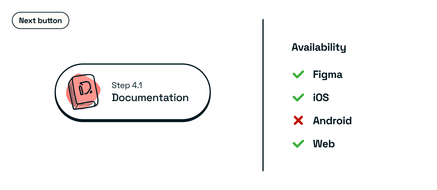
Availability
Platform availability and relevant links to all Figma and Developer implementation documentation.
If you embed your Developer docs into your usage guidance site, integrate it where relevant.
Outcomes
- Component documentation is available and understandable to others.
- A comprehensive guide for others to follow and understand your components.