What is it?
A review of the cross-platform component build to ensure alignment with the design.
Why do we do it?
Ensure our designs are consistent across platforms and align with our design specs.
How do we do it?
Start with a meeting
Align with the team on how you’re going to do the QA.
Depending on your platforms and setup, you might have a staging environment or a storybook where you can preview built components.
In certain instances where it’s harder for your Developers to share or for you to test, ask them to provide screenshots and videos of the component in action.
Use this session to work out what the best path forward is.
QA the work
Once you gain access to review the work, you’ll need to test the following areas to ensure they match your spec doc —
| Visual design |
| Component states |
| Interaction and animation |
| Responsive design |
| Cross browser compatibility |
| Accessibility — where relevant |
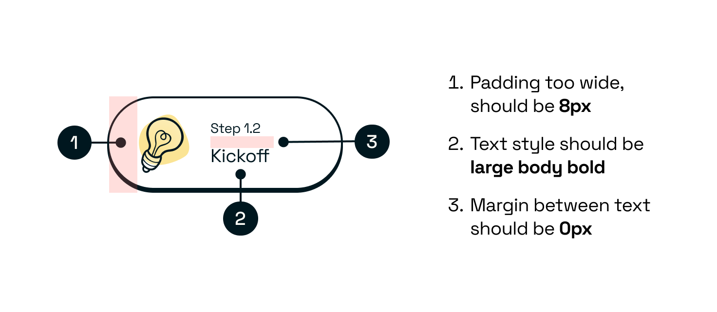
Giving feedback
I find it most effective for both Designers and Developers to keep it visual by using screenshots and adding documented comments — I usually do this in Figma.
Who needs to be involved?
All of the platform Developers that will be working on this. You may also want to loop in another Designer to support the QA.
Useful links
Outcomes
- Any additional fixes to build components to align them with the designs.
- Tickets to update build components.