What is it?
The build of your component in Figma for Designers and product teams.
Why do we do it?
So that designers can use branded components that align with the Design System to quickly create and ship experiences. These libraries are designed to save time for our product teams, allowing them to focus on creating better experiences for customers.
How do we do it?
Set up
Consistency in building components with variants and props is crucial for easier maintenance and understanding by others.
Here is an example setup for your components —
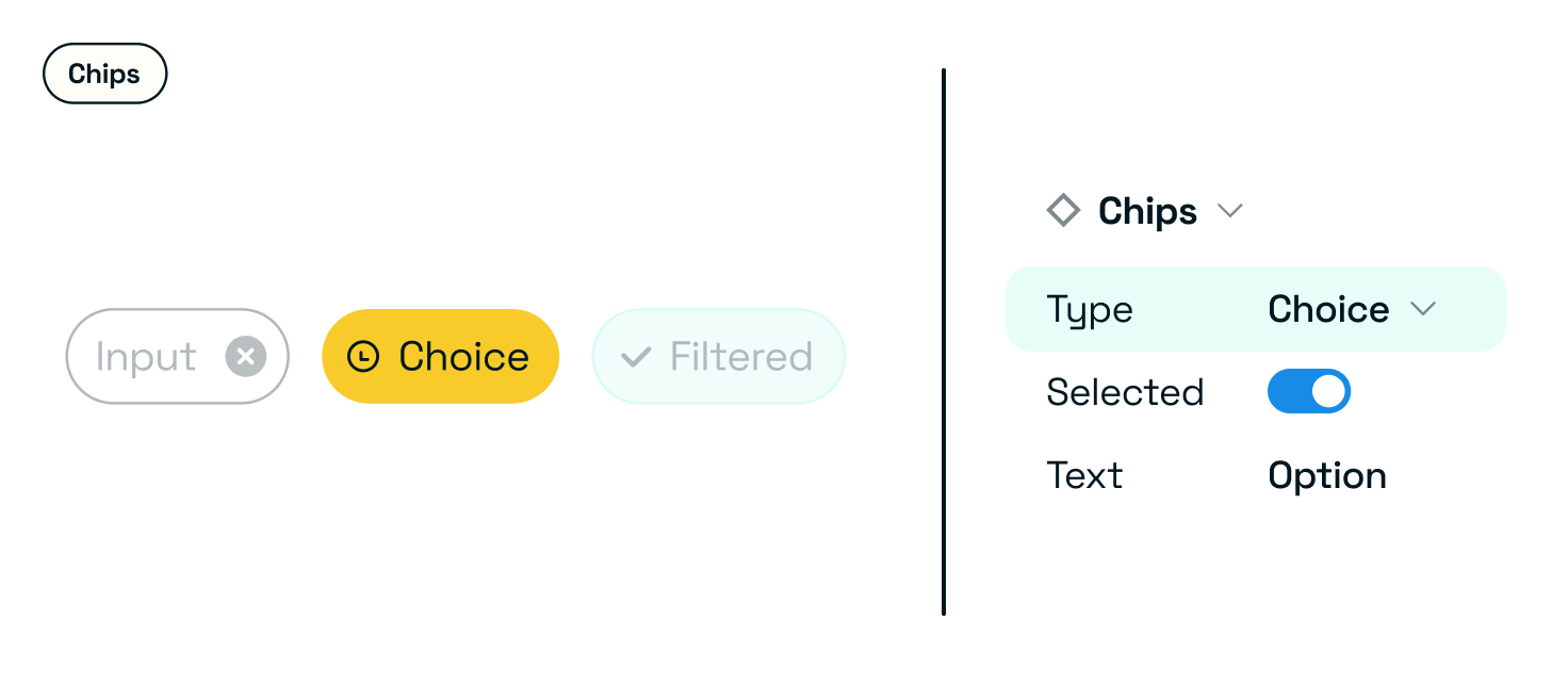
Type
Any variants based on different use cases.
Use a name that reflects what this property actually controls, rather than a generic label like type, which is often too vague.
Priority
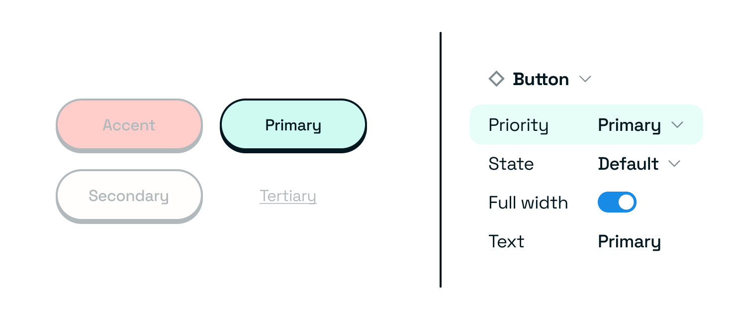
| Primary |
| Secondary |
| Tertiary |
| Accent |
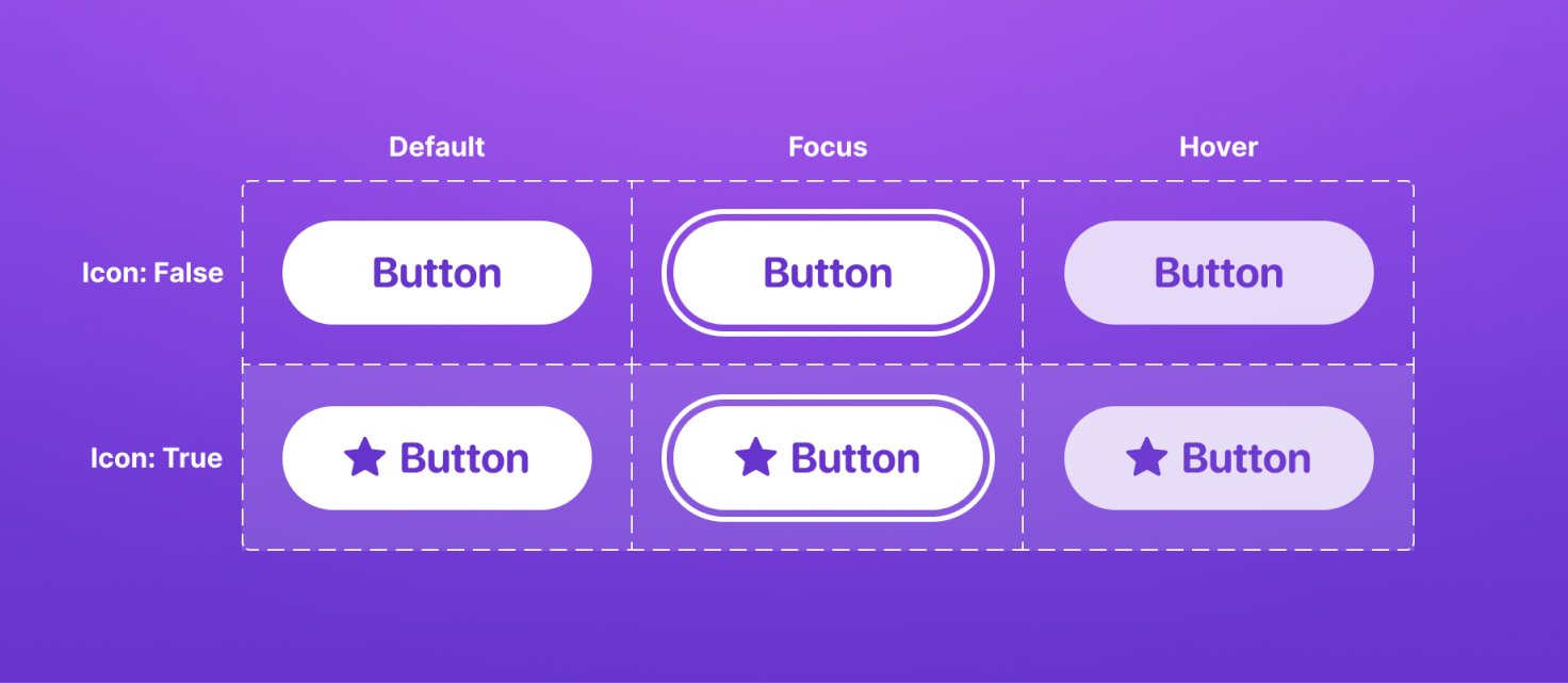
States
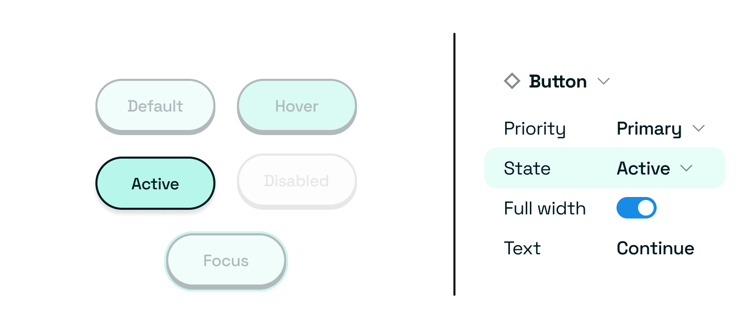
| Default |
| Hover |
| Disabled |
| Active |
| Focus |
Status
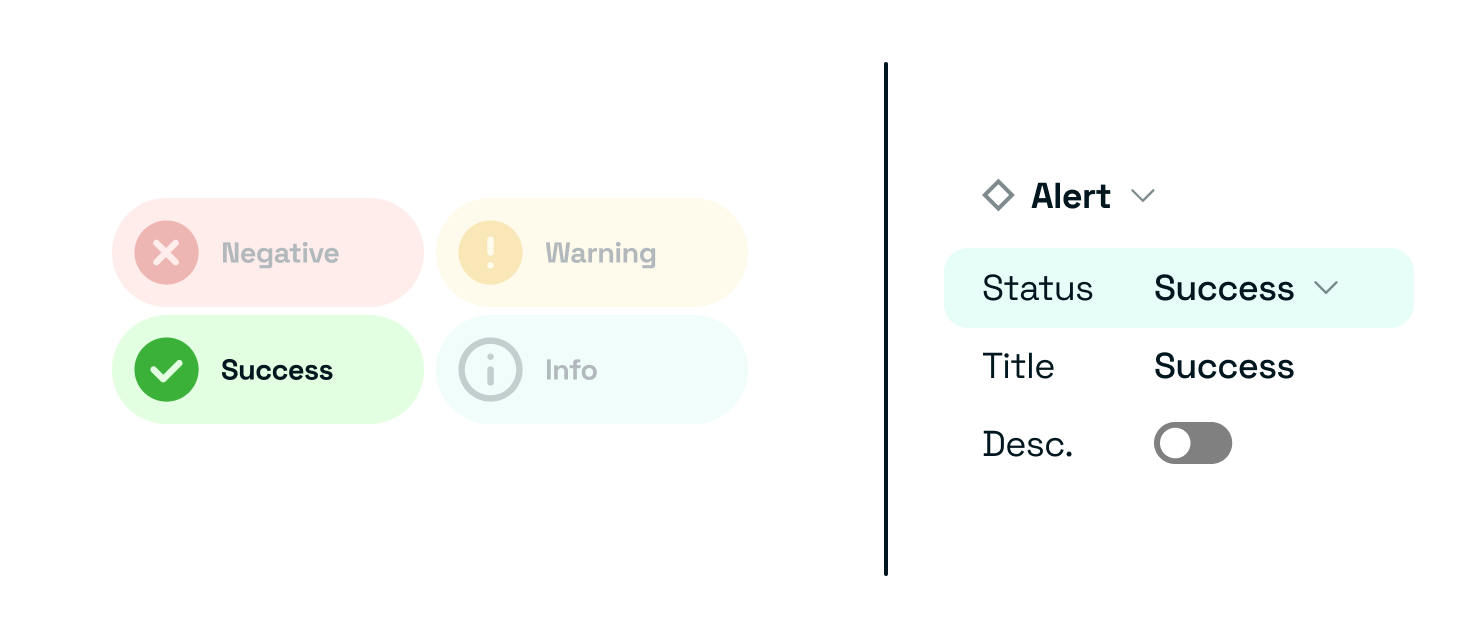
| Positive |
| Negative |
| Warning |
| Default/neutral |
Platform or screen size
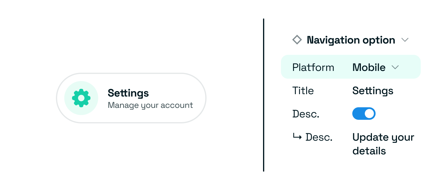
| Desktop / large |
| Tablet / medium |
| Mobile / small |
Sizes
Depending on how far you need to scale your sizes, you can either use tshirt sizes, which are best for groups that aren’t likely to scale beyond 3-5. Beyond that it’s best to be exlict and use the actual size values.
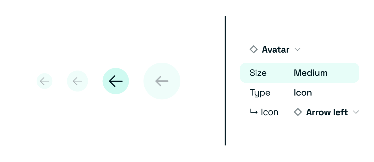
| Small |
| Medium |
| Large |
| or pixel value |
Booleans
For optional attributes or conditional elements. These are great for error states (for conveying multiple sentiments, consider using a sentiment type property)
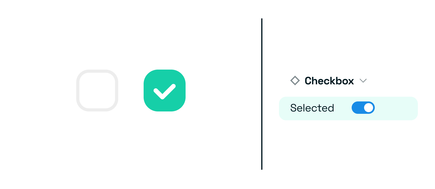
| Selected — Yes/No |
| Action button — show/hide |
| Optional Messages — show/hide |
Dynamic text
Use for all overridable text in components — allow for dynamic text inputs
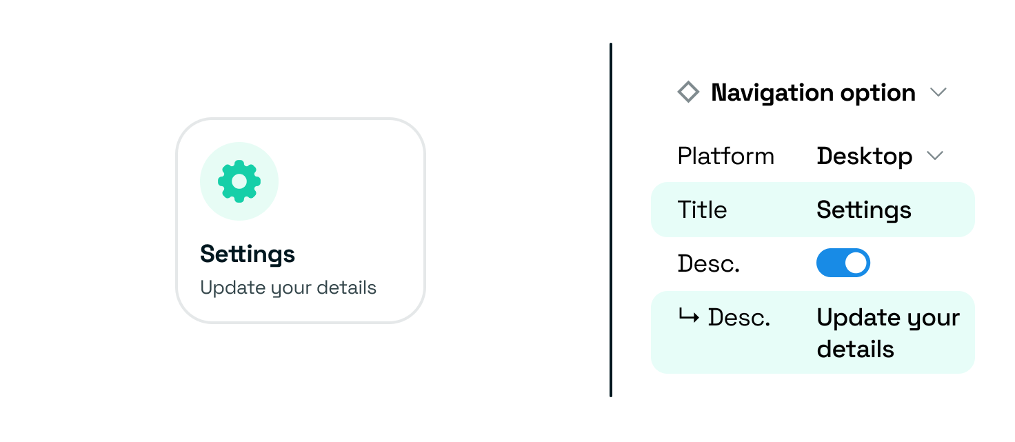
| Field |
| Message |
Fidelity
You want to ensure there is a fine balance between discoverability and flexibility. While it might feel easy just to create one state and rely on colour variables to do the rest, it doesn’t tell our Product Designers what states are available — it also gives them more work and an even greater margin of error.
Hiding too many options behind switches or configurations can confuse designers. Keep key variants visible.
Your Figma file
Layers and pages
Keep your Figma layers and pages clean. When someone uses your library, all of your work is put on display. If your files are messy, it can hurt your credibility and make it harder for people to find the components they need. Additionally, it can cause headaches for maintaining the system, both for you and anyone else responsible for it.
Display
To display all available variations of your component in Figma, use Propstar, a plugin that organises and visualises different variants and options in your master file.
This will make it easier for Designers to discover different component variations and uses.
Handy links
Outcomes
- Figma component that is accessible and understandable to Designers.