What is it?
The design phase, where we experiment and stress test as many options as possible across different use cases.
Why do we do it?
To push the boundaries of the norm and improve our product experiences.
How do we do it?
Review your requirements
Remember how we gathered requirements back in the product audit phase? Now’s the time to review them and connect the dots between your use cases.
While each instance may have used a particular UI pattern, is it the right one? This is an opportunity for you to challenge the UI, and better the UX to create something that scales.
Of course, sometimes a button is just a button. But, you’ll find instances where maybe, just maybe, there is a better solution or multiple solutions that solve these problems better. Let your requirements be your guide, as this will ensure you get adoption and support.
Start with a pen and paper
Keep it simple. Starting with a pen and paper is the easiest way to get ideas out fast.

“A computer is a Lite-Brite for bad fucking ideas.
— GFDA
Designing on our computers can quickly spiral into perfectionism. We strive to make our designs as high fidelity as possible. It also limits our thinking and exploration, relying on what we already know.
Get designing
- Go wild with designs — if you get stuck, try ideating with crazy 8s by yourself or with others.
- The further you push yourself, the more interesting the ideas get
- Explore new UI designs to challenge the existing experience and push your work further.
- Consider as many different scenarios and use cases as you can think of
- Prototype to explore animation and interaction
States to design
Depending on the component, some of these won’t be applicable.
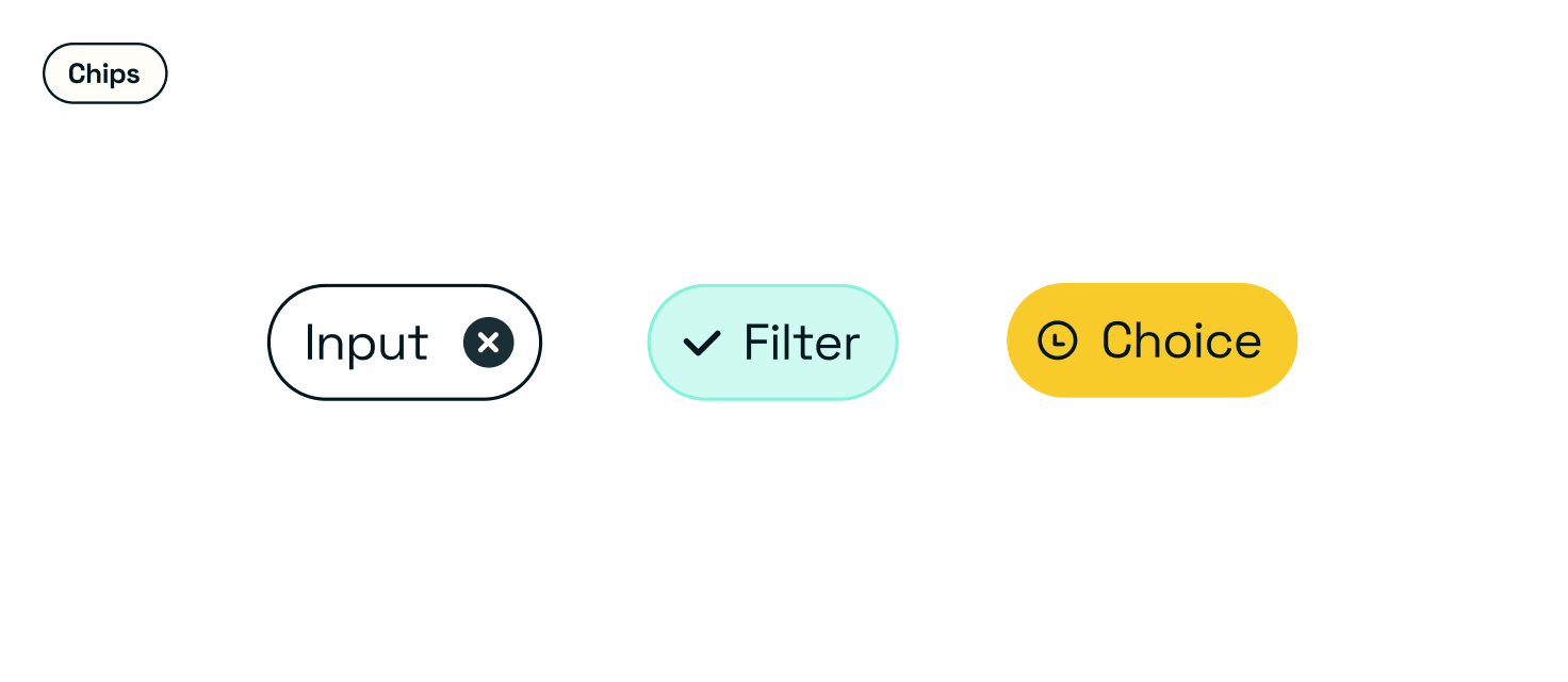
Type(s)
Type refers to the different variants of your component based on the use case. This will differ per component.
Priority
Priority is the loudness of your component.
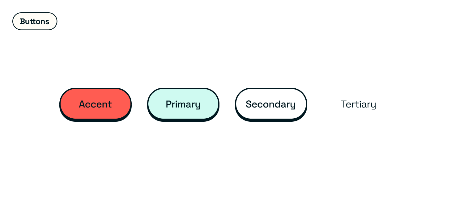
| Accent — optional, typically reserved to create a stronger emphasis to encourage action |
| Primary — where you want users to look first |
| Secondary — where you want users to look second |
| Tertiary — where you want users to look third, usually superfluous information or for things you don’t want them interacting with |
State
State refers to the interaction with the component within the experience.
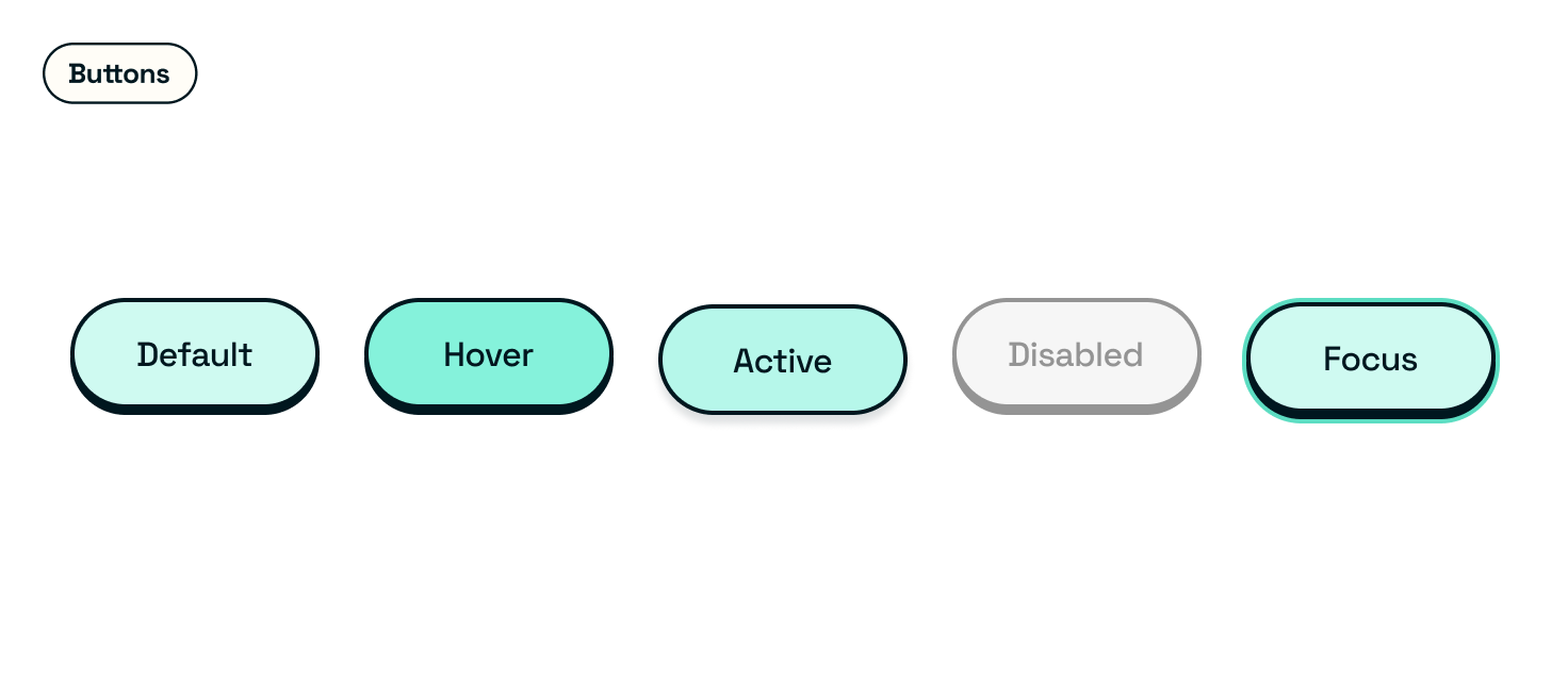
| Default — the component without any interaction |
| Disabled — when the user is unable to interact with the component |
| Hover — when the user hovers over the component, generally used for web only |
| Active or pressed — when the user is clicking or pressing on the component until the target action has loaded |
| Focus — when the user is tabbing between active states on the screen when using a keyboard |
Status
Status is visual feedback given to users to denote levels of urgency.
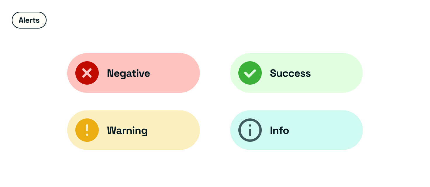
| Default/neutral — when there is no status |
| Positive — for positive actions or feedback |
| Negative — for errors in validation or if a user is about to complete a potentially damaging action |
| Warning — for issues that need to be resolved before they move to a negative status |
Platform or screen size
For responsive designs or cross-platform experiences.
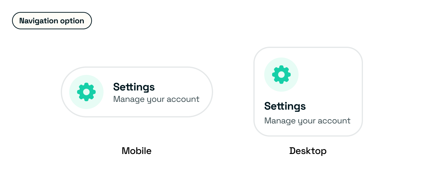
| Desktop / large |
| Tablet / medium |
| Mobile / small |
Booleans
Togglable elements
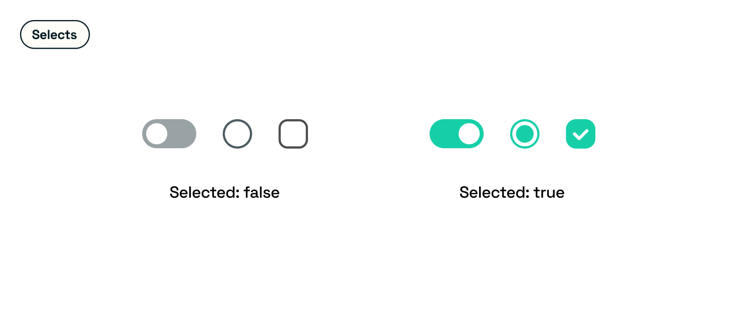
| show or hide |
| on or off |
| true or false |
Interaction and animation
How the component behaves when interacted with, including any potential animations.
Haptics
Any tactile feedback when the user is interacting with their mobile. Don’t add these just for the sake of it; consider the context and if it provides effective feedback for the user.
Accessibility considerations
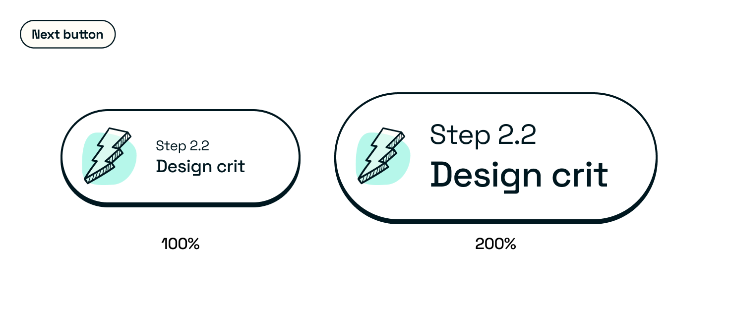
- Dynamic type scaling and how the component changes with larger and smaller fonts
- Be sure to look at how space grows and how the component repositions or swaps to a different experience at specific sizes.
- Pair with your Developers on this one in defining your scale. Each platform has different ways of scaling text, and if you have multiple platforms, it helps to align all of them to a % %-based scaling system.
- Voice over guidance
- WCAG guidelines
- APCA colour contrast
Colour Modes
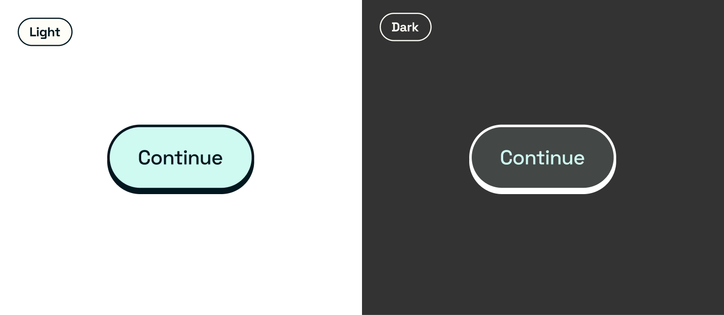
- Light
- Dark
- Any other colour modes you might have
Outcomes
- An expansive collection of design exploration across many different scenarios
- A design to take to the next phase
- A working prototype