Design System Tactics.
Whether you're starting fresh or maintaining a mature system, this growing collection of tactics is designed to help you make progress at every stage.
Creating Guidance Pages
A structured, repeatable format for documenting system components—explaining what they are, how and when to use them, and how to do so accessibly. Great guidance pages help teams implement components correctly and consistently, while reducing reliance on one-to-one support.
When to use it
Every time you launch or update a component—especially ones with complex behaviour, accessibility needs, or visual variants. These pages become key references for both designers and developers.
Steps
-
Start with the Basics
Introduce the component clearly: What is it? and When should you use it? Be brief, outcome-focused, and avoid assumptions about prior knowledge.
-
Add Visuals and Anatomy
Include diagrams or screenshots that highlight structure, variants, and key elements—like icons, labels, or actions. Label each part and explain their purpose.
-
Describe Behaviour
Document how the component behaves in various states (hover, focus, active, disabled, etc.) and how it responds across breakpoints or interactions.
-
Add Accessibility Guidance
Outline key accessibility considerations:
- Keyboard behaviour and focus order
- ARIA roles or attributes (if applicable)
- Screen reader expectations or patterns
- Guidelines for error messages or alternative text
-
Include “Dos and Don’ts” or Examples
Use visual examples to show best practices and common mistakes. Make it easy to grasp at a glance, especially for first-time users.
-
Link to Supporting Resources
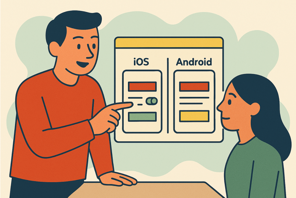
Provide links to Figma files, code implementations, token references, and testing tools. If possible, show both design and dev views side by side.
-
Keep It Skimmable and Friendly
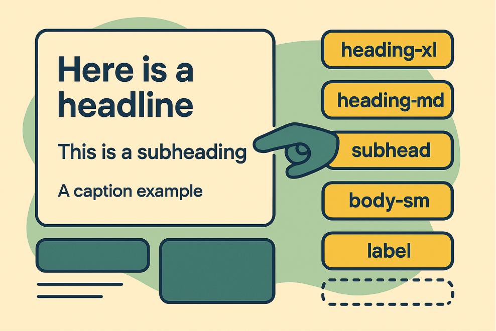
Use clear headings, short paragraphs, bullet points, and consistent formatting. Write like you’re helping someone who just joined the team.
Outcomes
- Confident, consistent component usage across disciplines
- Improved accessibility through shared standards and examples
- Fewer support requests and misaligned implementations
- Easier onboarding and faster ramp-up for new contributors
- A more inclusive system for all users and teams

